Log 3
Justin
Vandenbroucke
justinv@hep.stanford.edu
Stanford
University
9/25/02 –
10/16/02
This file contains log entries
summarizing the results of various small subprojects of the AUTEC study. Each entry begins with a date, a title, and
the names of any relevant programs (Labview .vi files or Matlab .m files – if
an extension is not given, they are assumed to be .m files).
9/25/02
AUTEC_programs_9/25/02
Wrote a new version of online code,
AUTEC_programs_9/25/02. This version
decouples of the threshold by channel, so each channel has a different adaptive
threshold. This obviates the need for
perfect correction of pressure levels for variation in phone gains. It also allows the lowest reasonable
threshold at each phone independently.
9/26/02
Analysis on erinyes
All data have been organized on
erinyes in /Data/AUTEC/AUTEC_data.
Matlab has also been installed and is running successfully.
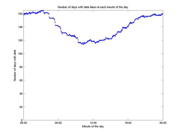
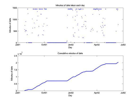
9/27/02
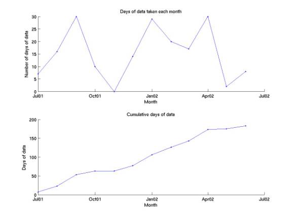
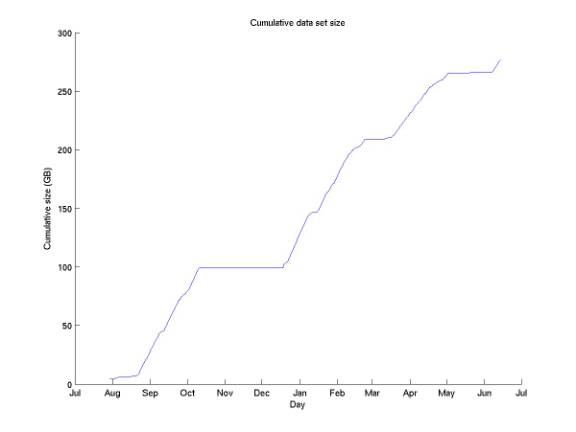
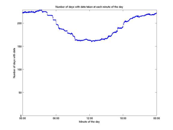
Data overview
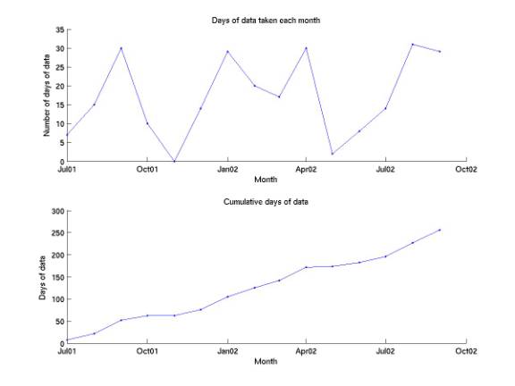
dataMatrix.m
mergeDataMatrix.m
plotDataMatrix.m
The plots below summarize the entire data set currently on disk
(through mid Jun 2002). More data for
Jun – Sep should be arriving shortly.
Of 183 days with 1 or more minutes of data taken, 94 have data taken for
all 1440 minutes of the day.
9/29/02
Test of AUTEC_programs_9/25/02
Received 5 minutes of data from
9/27/02 from the new online code. It
looks okay except for two things: there are no events in the 5 minutes (perhaps
the threshold is always slightly too high); the threshold array for the second
minute of data has zero entries.
10/02/02
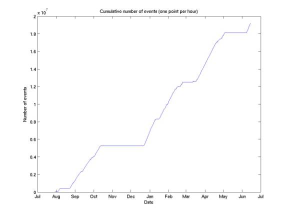
Data set status and accessibility
All data are uncompressed on
erinyes.stanford.edu. All file formats
(1-5) are now readable with readMinuteData.m and readEventRecord.m. Several days’ folders have been renamed from
yyyy.mm.dd to yyyy.mm.dddev, because they were taken during development and the
file format changed in a complicated way during them. With more work they could be readable.
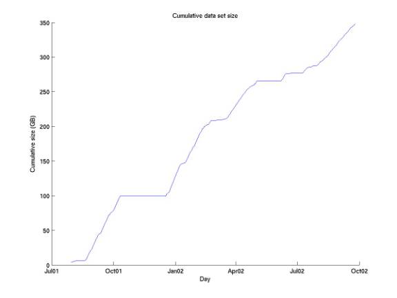
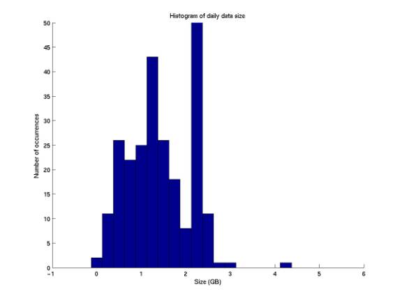
10/02/02
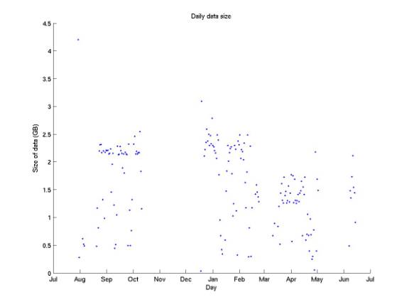
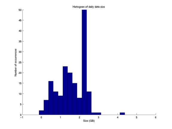
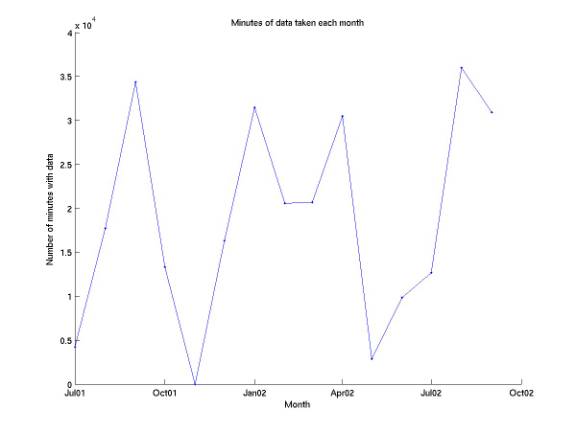
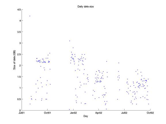
Size of data set
dataSize.m
The plots below summarize the size
of the data on disk, when uncompressed (typical data can be zipped to 15% of
its uncompressed size).
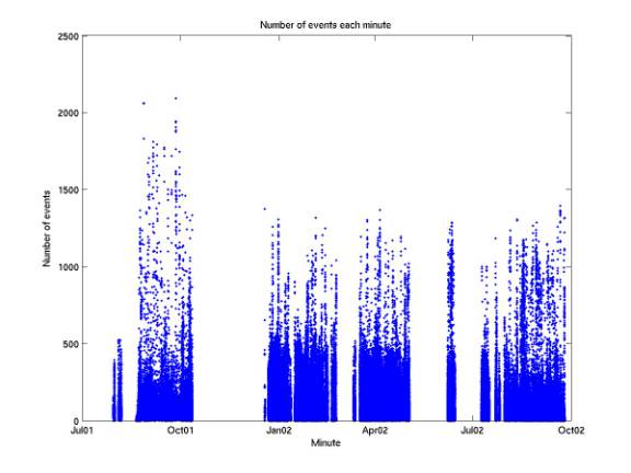
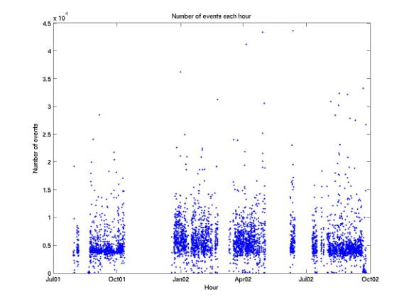
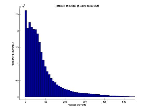
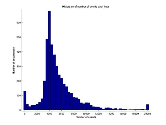
10/2/02
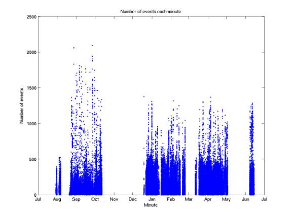
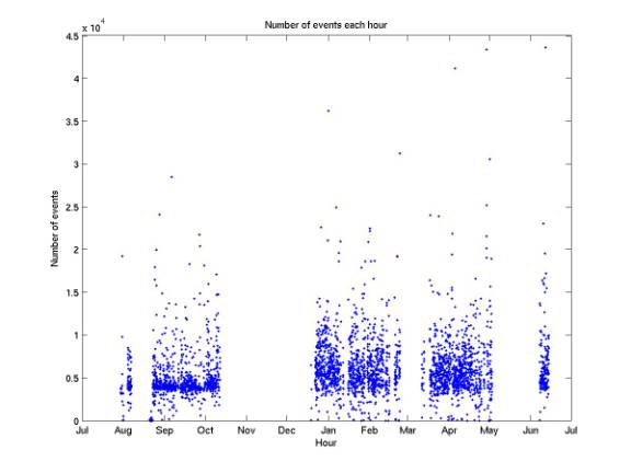
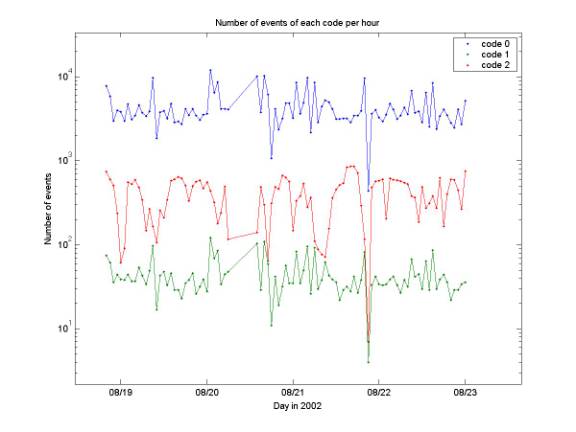
Event rates
plotNumEvtsLookup.m
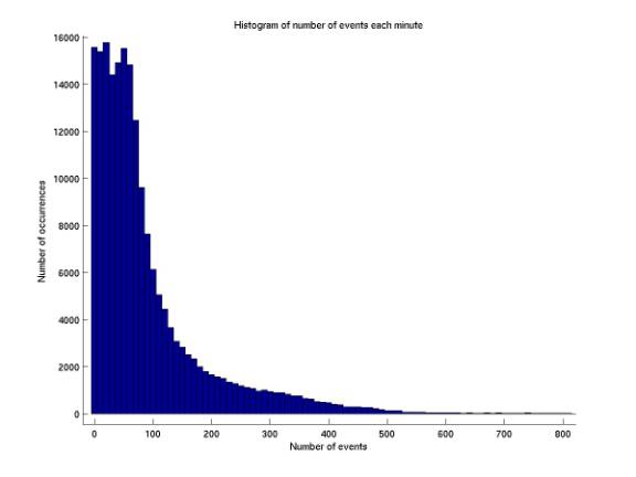
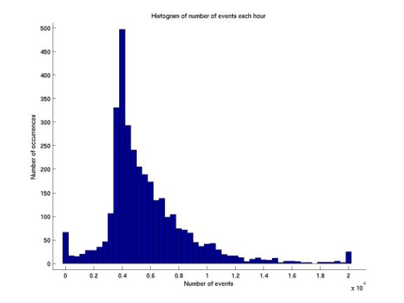
The plots below summarize our event rates.
10/2/02
Log of postamp changes
Dan Belasco sent me(email
10/2/02) the entries from his log that
indicate changes in post amp’s for our 7 phones. It’s as follows (changed from their numbering to ours and ignored
phones we’re not using):
10/11/01 irregular readings of 2, 4, 7
10/17/01 disconnected 1, 3, 5, 7 for repair
12/18/01 3, 5, 7 changed
all
340’s phones working except 346 (1)
12/20/01 346 (1) changed and working
replaced
2, 4, cks. Good.
1/4/02 1 changed
6/7/02 1, 3 replaced
8/15/02 7 replaced
10/2/02
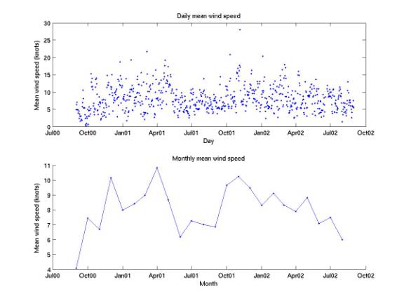
Wind speed data
plotDailyMeanNoiseEnergies.m
nassauCoords.m
NOAA has near-daily measurements of
mean wind speed at Nassau Int’l Airport available online (see
AUTEC_analysis/climate_data/mean_wind_speed/readme.txt). Each month has data for most days. Several
months are missing a few days at most.
I obtained data for 24 consecutive months, 9/00 – 8/02. The first plot below gives the daily values,
and the second plot gives the monthly mean of these values. There is wide variation in the daily
data. Rough annual structure is evident
in the monthly data. Nassau Int’l
Airport is located at a latitude of +2505 (25° 5“ N), a
longitude of –07746 (77° 46“ W), and
at 7 m above sea level. Our central
hydrophone is at 24° 24“ 28.8““ N, 77° 32“ 36.7““ W. In our coordinates, Nassau is 75 km North
and 23 km West of the central phone, or at a distance of 79 km 17 degrees West
of North.
10/2/02
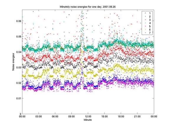
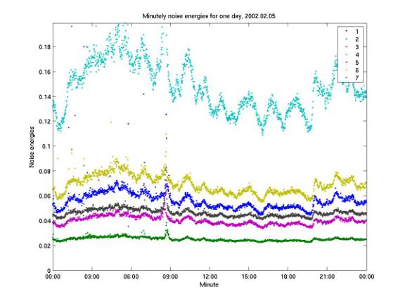
Structure in noise energies
plotDailyMeanNoiseEnergies.m
The plots below give the noise
energies in all channels at each of 1440 minutes during a day. Periodic structure is evident.
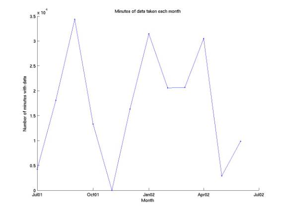
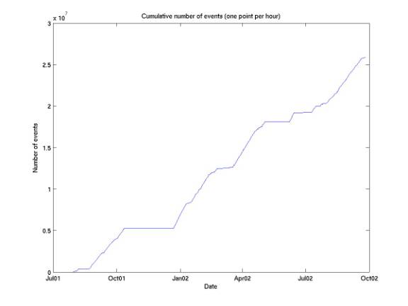
10/4/02
New data shipment
Below are plots updated to include a
shipment of data received 10/3/02. We
now have data for 3e5 minutes, equivalent to 208 days of continuous
running. We have 2.5e7 events, giving
an overall rate of 80 events / minute during live minutes.
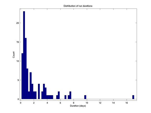
10/5/02
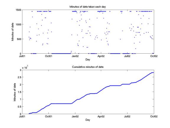
Distribution of run durations
plotLengthDist.m
The plot below gives the
distribution of run durations.
10/8/02
eventListComp.m
checkEventListComp.m
eventListComp.m, the program that
determines summary data for every event of every minute, has been run on all
data (took several days).
10/8/02
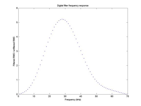
Filter frequency response
frequencyResponse.m
For every frequency from 1 to 60 kHz
in 1 kHz steps, a 56 ms sine wave was generated and sampled with the same
sampling frequency as online. It was
then run through our digital filter.
The plot below gives the ratio of the filtered RMS to the unfiltered RMS
for each frequency. This would be the
response if a pure sinusoid at each frequency hit the phone (with no noise
– the response function derivation assumed f-2 noise).
10/8/02
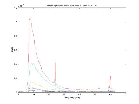
Spectrum
spectrumSTD.m
For comparison, the plot below gives
the power spectrum averaged over one hour.
Phone voltage levels are unrescaled.
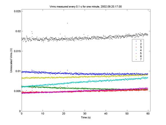
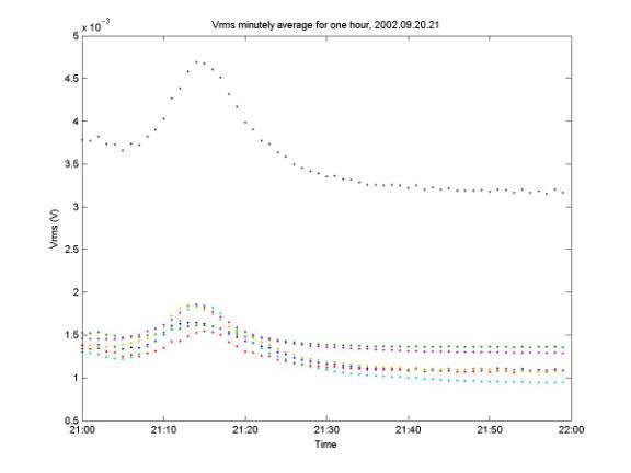
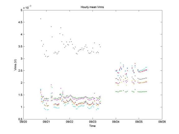
10/9/02
Accuratre Vrms measurements on all
time scales
plotVrms.m
Starting with file format 4,
installed 9/20/02, we calculate Vrms of every 0.1 s (17,900 sample) block of
data that is read. This allows accurate
and precise determination of Vrms on more time scales (before we were limited
to a minutely measurement derived from the power spectrum). The three plots below give Vrms’s evolution
over different time scales: one minute, one hour, and several days. The one-hour example is somewhat unusually
smooth. Many are entirely flat
(constant Vrms values) and many have periods of chaotic fluctuation.
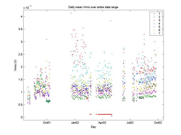
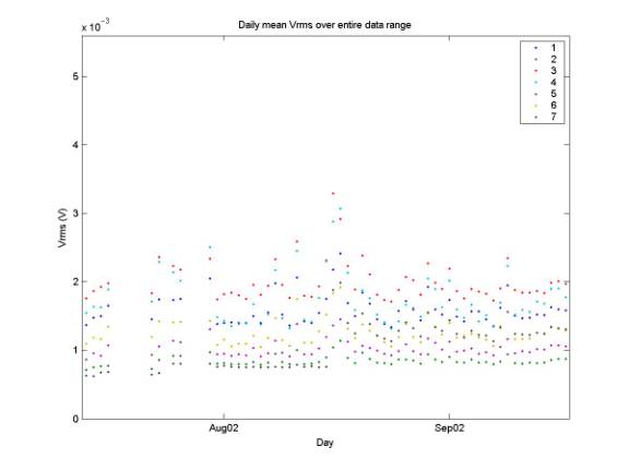
10/9/02
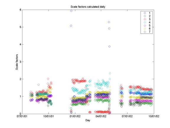
Vrms over entire data range; gains
calcMinutelyNoiseEnergies.m
calcGains.m
plotGains.m
A noise energy is calculated each
minute for each channel. Noise energy
is the power in all freqeuncies as determined from the minutely spectra,
determined from 0.1 s of data. Vrms can
be determined from noise energy, so a Vrms value is determined every
minute. The plot below gives the daily
mean of these minutely Vrms measurements.
These values are not corrected for gain. The solid line in April 02 is due to one channel being down
(channel 3).
10/10/02
Radar noise
plotGains.m
plotListSpectra.m
On 8/21/02, the radar at Site 3 was
removed (email from Dan Belasco, 10/9/02).
We would like to find the effect of this change on noise (Vrms; at
various frequencies; spike noise (50 kHz); correlated noise (60 kHz)). The first plot below gives unrescaled Vrms
values over time. There is no apparent
change around 8/21/02. Similarly, there
is no change in hourly mean powers (determined from minutely spectra) at 10, 20,
30, 40, 50, or 60 kHz. The second plot
below gives rates of each event code before and after the radar was
removed. Recall codes 0 and 1 designate
uncorrelated events; code 2 designates correlated electronic noise. The rate of correlated noise events does not
change with removal of the radar.
10/10/02
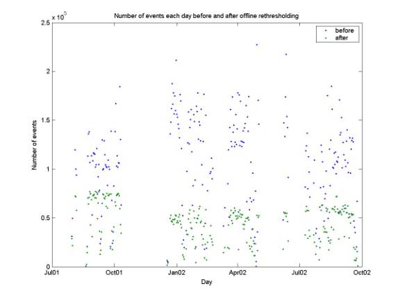
Offline rethresholding
keepBest60.m
plotDailyNumEvts.m
numBestEvtsLookupTable.m
numEvtsPerMinute.m
Due to the inadequate adaptive
thresholding algorithm that has been running until recently, some minutes have
a threshold much too low and are swamped by data (eg ~1000 events in one
minute, compared to the 60 events per minute target rate). keepBest60.m rethresholds offline, raising
the threshold in steps of 0.004. The
plot below gives the daily event rates before and after rethresholding. The total number of events is 26 million
(25.879407e6) and 11 million (10.760885e6) events (42% of events was
retained). On days that have events,
the average number of events per day is 106 thousand before rethresholding and
44 thousand after.
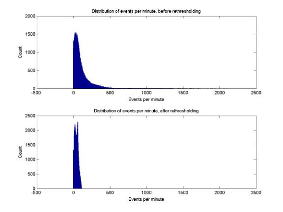
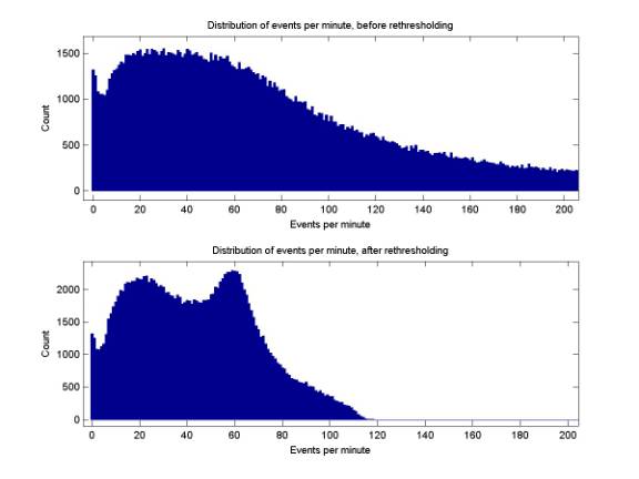
The first two small plots below give
the distribution of events per minute over the entire data set, before and
after offline rethresholding. The long
tail of the distribtion is cut by rethresholding. The second pair of small plots gives close-ups of the same
plots. It is unclear why there is a
peak at ~20 events per minute separate from that at 60 events per minute. Perhaps there is some interesting phenomenon
occurring with an average rate of every 3 s that accounts for the peak at 20;
and the peak at 60 is due to triggering on gaussian noise when there is nothing
interesting going on. The peak at ~0
events per minute is likely due to the long time taken for the threshold to reach
low values when the noise level drops suddenly.
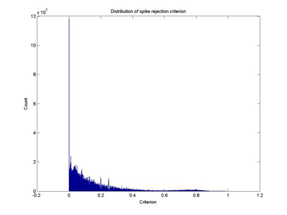
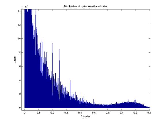
10/11/02
Spike events
findPointDisplacements.m
spikeDistribution.m
findPointDisplacements has been run
on all data (a new version is running now which writes nan when events have
zero time series length; as of now they were ignored which messed up the count
for each hour). The algorithm is as follows: For each event let len
be the smaller of 179 and the length of the time series. Then let
Vabs be the absolute value of the first len samples of the
time series in the triggering channel.
Find the largest value (max1) and second-largest value (max2)
of Vabs. The spike rejection
criterion is then defined to be (max1 – max2) / max1. It ranges from 0 to 1, with larger values
for point displacements. The first plot
below gives the distribution of the criterion for all events, with a bin size
of 1e-3. The large number of events
with criterion 0 are likely due to events in which the first- and second-
highest amplitude samples are in the same ADC bin. There was a period early in running when the ADC dynamic range
was too small, which would have increased the rate of the two largest-amplitude
samples having equal amplitude. The
second plot below is a closeup showing that there are two populations,
corresponding to spike events (above 0.6) and non-spike events (below 0.6).
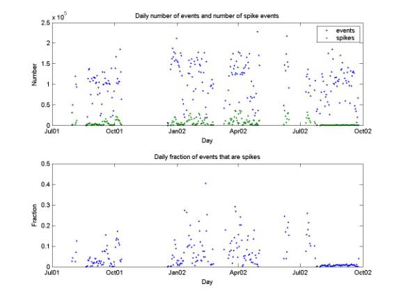
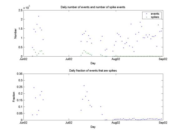
10/11/02
Spike events were correlated with
Site 3 radar
dailySpikeRate.m
The first plot below gives the total
number of events each day as well as the number of spike events each day (were
an event is considered a spike if its criterion is above 0.6). Overall, of 25 (25.877921) million events,
1.6 (1.622968) million are spike events, corresponding to an overall rate of
6%. The Site 3 radar was removed on
8/21/02. The second plot gives a close
up of June-August 2002 (tick marks on the abscissa indicate the first day of
each month). Clearly the rate of spike
events dropped significantly when the radar was removed.
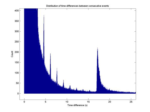
10/11/02
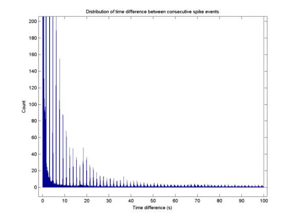
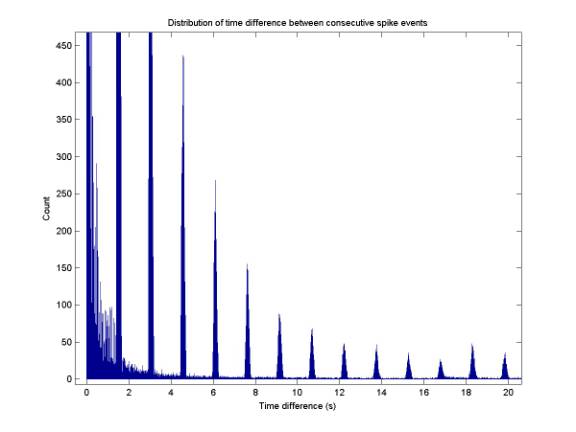
Confirmation of 1.5 s rep rate for
spike events
spikeDtDistribution.m
Time differences were determined between
consecutive spike events (those with spike criterion > 0.6). The distribution of time differences is
shown in the two plots below (the second is a closeup). Spike events are seen to occur every ~1.5
s. More precisely, the 50th
peak occurs at ~76 seconds, giving a period of 76 s /50 = 1.52 s.
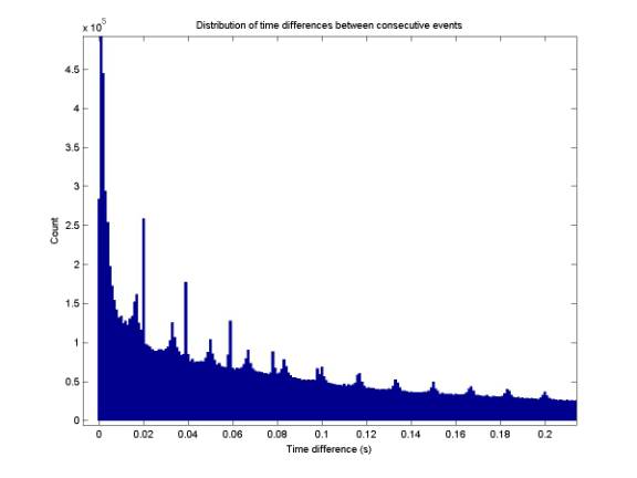
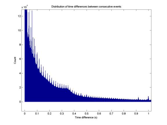
10/11/02
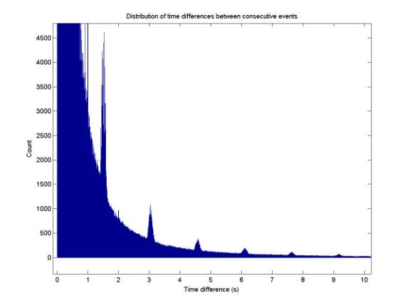
Periodic structure of all events
dtDistribution.m
The four plots below are the same
histogram with different windows. The
histogram gives the distribution of time differences between all events. The four plots show the following structure:
(1) Periods of both 17 ms (60 Hz) and 20 ms (50 Hz); (2) An unexplained bump at
~0.35 s (rep rate of some biological signal?); (3) 1.5 s – periodic spike
events; (4) dt’s enforced to be greater than 17 s by buffer overflows (length
of buffer is 17 s), as well as 1.5 s structure still evident.
10/11/02
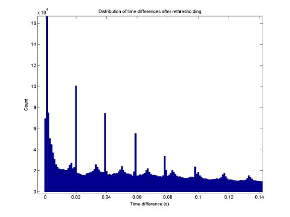
Periodic structure of all events
after offline rethresholding
dtDistributionBest.m
Reconstructing the above plot only
considering the ~1/2 of events that remain after offline rethresholding, the
peaks are retained while the smooth (exponential?) background is reduced. The plot below shows the 17 and 20 ms
structure, which stands in greater relief against a lower background.
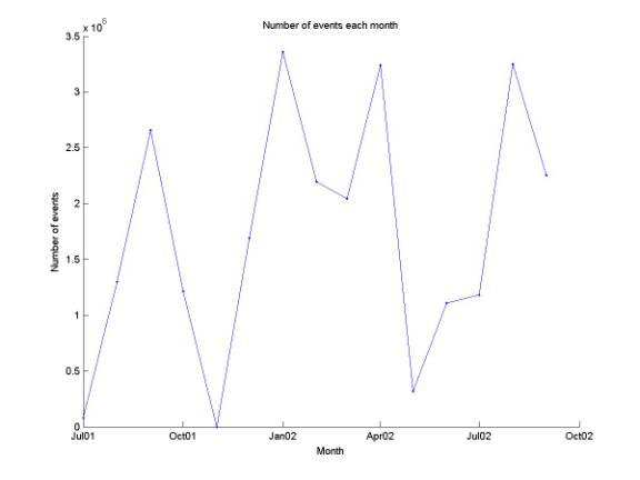
10/15/02
Monthly number of events
plotNumEvtsEachMonth.m
The plot below gives the number of
events recorded each month. The total
number of events is 25.883803 million.
10/15/02
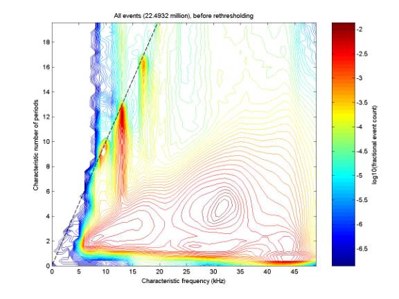
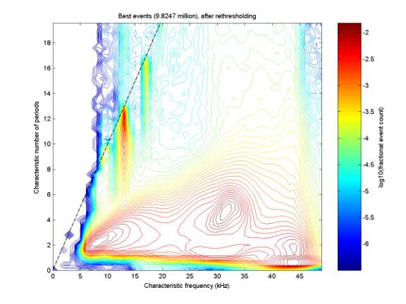
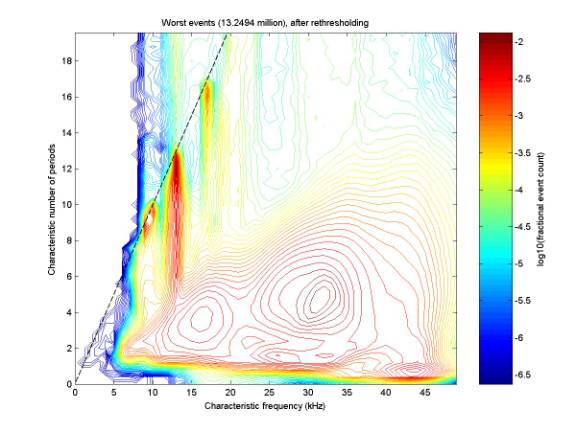
Nikolai’s parameters
nikParams.m
fn.m
plotFn.m
fnBest.m
Nikolai’s parameters have been
calculated for almost all events. The
first plot below is Nikolai’s mountain plot for all events. The second plot gives the mountains after
offline rethresholding has occurred.
The third plot gives the mountains for those events that were removed y
offline rethresholding. It is puzzling
why the three plots are so similar.
10/16/02
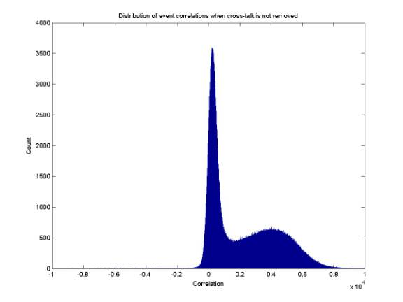
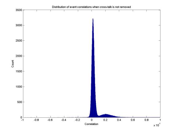
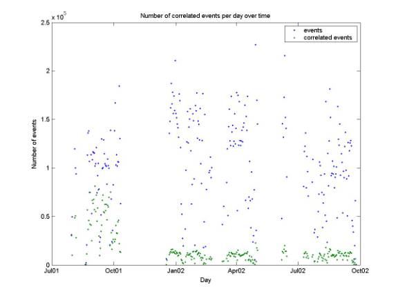
Correlated events (electronic noise)
eventCorrelationsCross.m
plotCorrelationDistribution.m
plotCorrelatedEventsPerDay.m
(data are in
mat_files/eventCorrelationsCross; check this if you run any of the above codes)
Both online and offline, we have
been removing cross-talk before calculating the correlation in order to reject
60 Hz electronic noie correlated events.
However, it appears that we can distinguish the noise from good events
without removing cross-talk. The first
plot below gives the correlation of every event until the December 2001 upgrade
(during which the second-level trigger to reject correlated events was
installed), calculated without first removing cross-talk. There is one peak centered at 200 and
another at 4000. They can be separated
at roughly 1600. The second plot gives
the same distribution for the first 10 days of Run II (after the December
upgrade). Only events of code 1 or 2
were considered (those that passed both triggers). The third plot gives the number of total number of events and the
number of events with this correlation above 1600 each day.
10/16/02
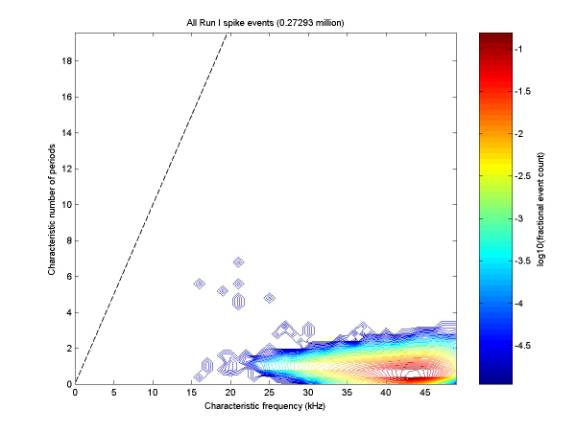
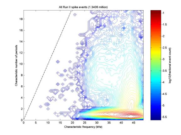
Nikolai parameters for spike events
findPointDisplacements.m
fnSpike.m
plotFn.m
The plots below gives Nikolai’s parameters for spike events (defined to
be those with criterion > 0.6).
There is a distinct difference between Run I (before December 2001) and
Run II (after December 2001). Plotting
one distribution for each month confirms that there is a change at December
2001. I believe I might have changed
the ADC binning in December, which would have changed the distribution of the
spike criterion and therefore change how we determine spikes.
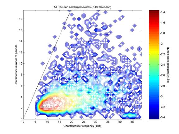
10/16/02
Nikolai parameters for correlated
events
fnCorrelated.m
plotFn.m
The plot below gives Nikolai’s
parameters for correlated events (events of code 2 – those that were rejected
by level 2 trigger online) during Dec 2001 and Jan 2002. There was a small bug in calculating the
correlation online that has since been fixed.
The distribution my be more strongly localized with the bug fixed.
10/16/02
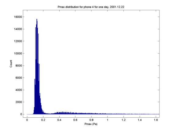
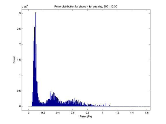
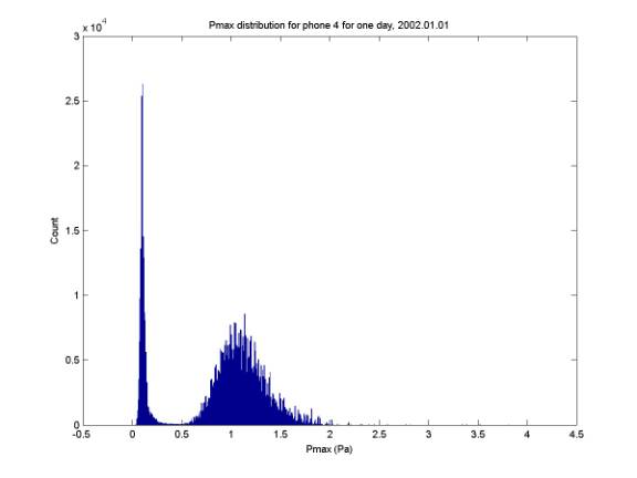
Distribution of peak pressure
plotPmaxDistribution.m
Each of the three plots below gives
the distribution of peak pressures of events for one phone (the dominant one,
4) for one day. There appears to be one
peak corresponding to events near the gaussian noise and one for events above
the gaussian noise (?) Many days have
two secondary peaks, as in the second plot.
The value of the pressure is only good to within a factor of 2 due to
uncertainty in the phone gains. For
comparision, Nikolai’s paper predicts peak pressures of 0.5 Pa and 0.1 Pa,
respectively, for hadronic and electromagnetic showers at ideal angles 1 km
from the shower.
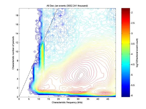
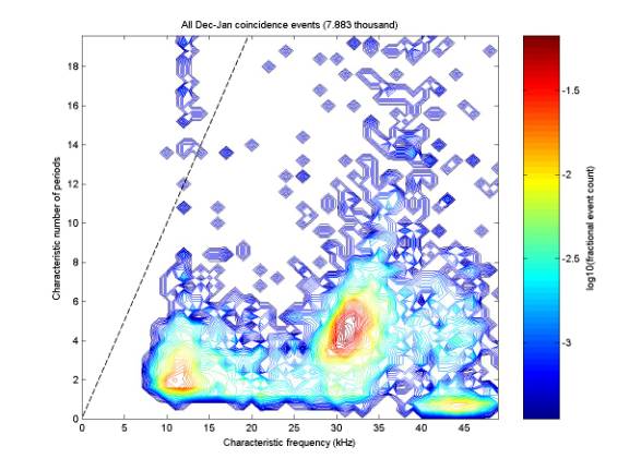
10/16/02
Nikolai’s parameters for coincidence
candidates
fnCoincidence.m
plotFn.m
The first plot below gives Nikolai’s
parameters for all events from ~ Dec 22 2001 – Jan 22 2002. The second plot gives parameters for
single-phone coincidence candidates during the same period. Here a coincidence candidate is a
single-phone event that is part of at least one quadruplet that passes
coincidence windowing and has one or two hyperboloid intersection in the
fiducial cylinder. Note that enforcing
coincidence reduces the single-phone event count by a factor of 500. So if we have 25 million events total, we
expect only 50 000 coincidence events, or 200 events per day on average. However there is still a difficult combinatorics
problem: each coincidence candidate is a member of perhaps 10 different
quadruplets. So the rate of quadruplet
coincidence candidates is only a factor of ~60 less than the single-phone rate.