Log
7
Justin
Vandenbroucke
justinv@hep.stanford.edu
Stanford
University
1/3/03
– 1/10/03
This file contains log entries
summarizing the results of various small subprojects of the AUTEC study. Each entry begins with a date, a title,
and the names of any relevant programs (Labview .vi files or Matlab .m files
– if an extension is not given, they are assumed to be .m files).
1/3/03
Strange contours
acousticRect
(Linux executable) – rects 36:41
calcFilterValuesMean.m
mergeRectList.m
plotDetectionVolumeRect.m
To review: the
scalloped pattern (reproduced in the first plot below from a 12/12/02 entry)
was confusing. Simulations were
run with greater temporal (dt = 0.7 us) and spatial (dx = 150 m; dy = 0.5 m)
resolution. With dt 8 times lower
than that used by our experimental ADC, we could sample at 5.6 us 8 different
ways. For each point, we did it
each of the 8 ways and averaged them together, yielding the second plot
below. We see that, in addition to
being smoother, the strange vertical bars are removed. However the large-scale scalloping
remains.
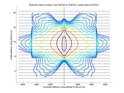
Figure 1
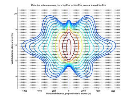
Figure 2
1/3/03
Pressure
contours
We have been
plotting filter value contours; ie detection contours. Below we plot peak pressure contours to
see if the same shape is reproduces.
The same general scalloping is present, perhaps to a lesser degree.
The first plot
below gives values obtained by generating 8 different time series from the 8
ways of sampling at 5.6 us, and averaging the 8 together. The second plot gives the maximum of
the 8 peak pressures. The two are
nearly indistinguishable. The
third and fourth plots below gives close-ups of the same two plots, in which
small differences are apparent.
In summary we see
that the scalloping is present in the peak-pressure contours and is not caused
by poor time sampling.
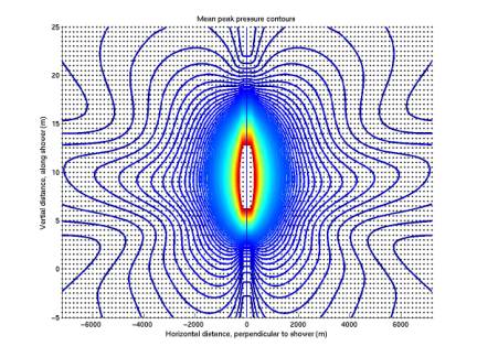
Figure 3
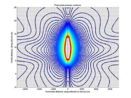
Figure 4
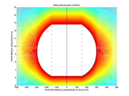
Figure 5
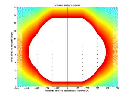 Figure 6
10/7/02
Extended cross-section estimates
sigmaEstimate.m
plotSigmaEstimate.m
The plot below gives sigma estimates in
the range 1020 eV to 1021 eV. Estimates are calculated with a power law given in Gandhi et
al, hep-ph/9512364. This is my
current target range for our flux limit.
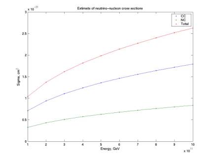
Figure 7
10/8/02
Extended detection contours
acousticRect
calcFilterValuesMean.m
plotDetectoinVolumeRect.m
The first plot below is from rect’s
36 to 41; the second from rect’s 42:47 (each rect is a rectangle of grid
points; each has a folder /Data/AUTEC/AUTEC_analysis/acoustic/rectNN/ on
erinyes; see …/AUTEC_analysis/text_files/rects.txt for the running
parameters given to acousticRect, or look at …/rectNN/input.txt) The first plot is our current best
contours for 1020 eV to 1021 eV with threshold of 0.05.
Switching
to a lower threshold, such as 0.01 (which is attained ~ 5% of running time)
– one-fifth as large, yields the same contours as 0.05 with 5 times as
large energy (because neutrino energy, peak pressure, and peak filter value are
all linearly related). So we need
to extend our contours significantly to calculate acceptance with low
threshold. This makes sense
– we should have very large effective volume and acceptance with a very
low threshold. We need a sparser
grid to make it larger. The second
plot below gives contours with the new grid. They are consistent with the first plot. The second plot shows the contours for
higher energies (1021 to 1022 eV). They extend to a radius of 20 km! The strange pattern is even stronger
now.
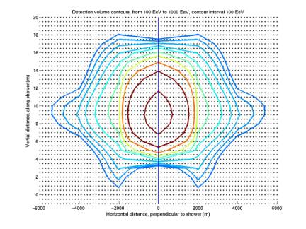
Figure 8
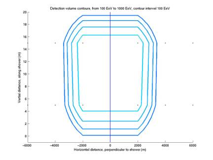
Figure 9
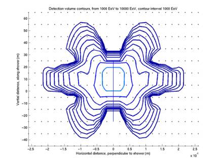
Figure 10
10/8/02
Extended acceptance curves
calcAcceptanceMC.m
calcAcceptanceVsE0.m
plotAcceptanceVsE0.m
plotAcceptanceMultiThresh.m
The first plot below gives acceptance
curves extended to the range 1021 eV to 1022 eV. All curves are for a threshold of
0.05. Each curve corresponds to
requiring a different number of phones hit.
The second plot below gives acceptance
curves for various thresholds, all requiring 4 phones hit. They were all generated by using the
4-phone curve from the first plot below and simply rescaling the energies,
maintaining the same values for acceptance: E = E0 * thresh / thresh0. The 0.05 threshold curve in the second
plot is the same as the 4 phone curve in the first plot.
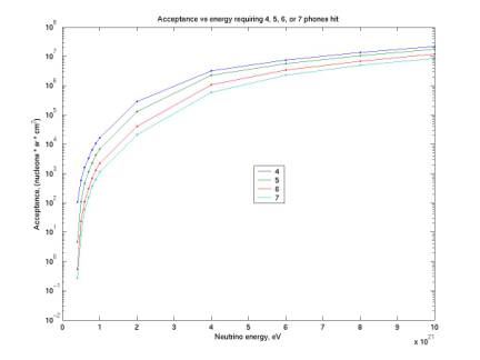
Figure 11
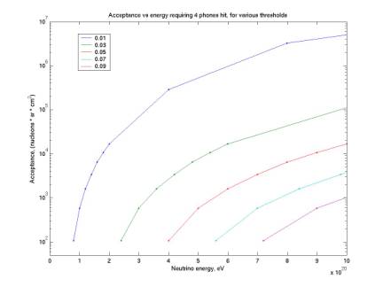
Figure 12
1/11/03
More exploration of fringing pattern
plotDetectionVolumeRect.m
plotNumbers.m
plotWaveforms.m
gridFilter.m
The
first plot below reproduces a previous plot, with different coloring and labels
indicating particular grid points.
The second plot gives the simulated pressure waveforms at each grid
point. Note that the contours
represent peak filter values, while the time series are for pressure. As shown above, the fringing pattern is
present in both peak-pressure and peak-filtered pressure contours. The table below gives peak pressure
values and peak filtered-pressure values.
The
fringing seems to a kind of diffraction pattern from the line source. We do not expect simple spherical
wavefronts because the source is not spherical. Considering that the waveform at a particular grid point is
the superposition of all the waves generated along the line, the points along
each radius from the center of the contours the correspond to a different
For
spherical contours we would expect signals at points 1, 2, 3 to be similar, and
those at 4, 5 to be similar.
However as shown in the table and the contours, 3 has a lower value of
both pressure and filter value than 1 and 2. 3 and 4 actually have similar waveforms, and peak pressures,
with 3 stretched in time relative to 2.
So apparently 4 has a width that matches the response function
better. The fringes are then
present in both pressure and filter contours, but stronger in filter contours.
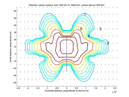
Figure 13
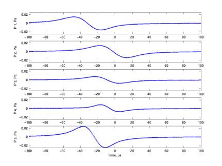
Figure 14
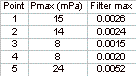
Table 1